CSS architecture ảnh hưởng tốc độ ship + maintain hơn anh nghĩ. Bài này so sánh 4 cách chính: BEM, Tailwind, CSS-in-JS, CSS Modules - kèm code thực tế và quyết định cho dự án 2026.
BEM - Block element modifier
Naming convention thuần CSS từ 2010s. Class theo pattern.block__element--modifier:
css.button { padding: 8px 16px; border-radius: 6px; }
.button--primary { background: #2563eb; color: white; }
.button--small { padding: 4px 8px; font-size: 12px; }
.button__icon { margin-right: 4px; }
.button__label { font-weight: 600; }html<button class="button button--primary button--small">
<span class="button__icon">👍</span>
<span class="button__label">Like</span>
</button>Mạnh: scope rõ, không runtime, học 5 phút. Yếu: verbose, khó refactor, không tận dụng JS.
Tailwind - utility-first
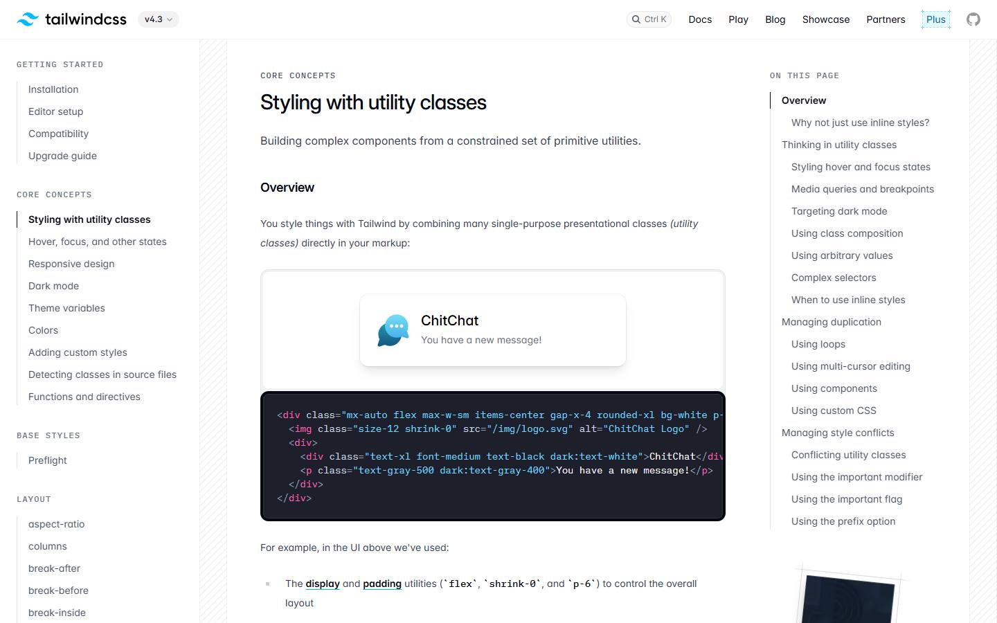
tsx<button className="px-4 py-2 rounded-md bg-blue-600 hover:bg-blue-700 text-white font-semibold">
  Like
</button>
Mỗi class = 1 property. Compose để build component. Bundle cuối tree-shake -> chỉ ship class đã dùng.
Mạnh: ship nhanh không jump file, RSC-friendly (no runtime), bundle nhỏ, design token qua config. Yếu: HTML verbose, learning curve class name, design system phải kỷ luật.
Component layer giải verbose:
tsx// components/button.tsx
import { cva } from 'class-variance-authority'

const buttonStyles = cva('rounded-md font-semibold transition', {
  variants: {
    variant: {
      primary: 'bg-blue-600 hover:bg-blue-700 text-white',
      secondary: 'bg-gray-200 hover:bg-gray-300 text-gray-900',
    },
    size: {
      sm: 'px-3 py-1.5 text-sm',
      md: 'px-4 py-2',
      lg: 'px-6 py-3 text-lg',
    },
  },
  defaultVariants: { variant: 'primary', size: 'md' },
})

export function Button({ variant, size, ...props }) {
  return <button className={buttonStyles({ variant, size })} {...props} />
}
CSS-in-JS - styled-components, emotion
tsximport styled from 'styled-components'

const Button = styled.button`
  padding: 8px 16px;
  border-radius: 6px;
  background: ${props => props.primary ? '#2563eb' : '#e5e7eb'};
  color: ${props => props.primary ? 'white' : 'black'};

  &:hover {
    opacity: 0.9;
  }
`

<Button primary>Click</Button>
Mạnh: JS variable + CSS, scope tự động, dynamic styling. Yếu: runtime cost (~10KB lib + parse), không compatible RSC tốt, bundle to hơn Tailwind sau scale.
Zero-runtime alternatives: Linaria, Vanilla Extract - extract CSS ở build, không runtime. Tốt nhất cả hai world.
CSS Modules
css/* button.module.css */
.button { padding: 8px 16px; border-radius: 6px; }
.primary { background: #2563eb; color: white; }tsximport styles from './button.module.css'
<button className={`${styles.button} ${styles.primary}`}>Click</button>Build tool sinh class name unique button_button__a8f3 -> tránh collision. Pure CSS, không runtime, scope tự động. Phù hợp khi đã có CSS sẵn hoặc team thích CSS thuần.
So sánh thực tế
| Khía cạnh | BEM | Tailwind | CSS-in-JS | CSS Modules |
|---|---|---|---|---|
| Bundle final | Nhỏ | Rất nhỏ (tree-shake) | Vừa-Lớn (runtime) | Nhỏ |
| Runtime cost | 0 | 0 | 10-30KB + parse | 0 |
| RSC support | OK | Excellent | Khó | OK |
| DX | Verbose | Quick | Best (JS power) | OK |
| Refactor | Khó | Dễ | Dễ | Vừa |
| Design system | Tự build | Config-driven | Theme provider | Variable + import |
| Learning | 5 phút | 1-2 ngày | 1 ngày | 5 phút |
Khuyến cáo cho dự án mới 2026
- Project Next.js / RSC: Tailwind + cva + shadcn/ui. Default mặc định.
- Component library publish: CSS Modules hoặc Vanilla Extract. Bundle predictable.
- Legacy migrate: BEM -> CSS Modules (incremental) -> Tailwind (lâu dài).
- App SPA cũ: Tailwind chuyển dần. CSS-in-JS chỉ giữ nếu đã đầu tư nặng.
Kết luận
Không có winner tuyệt đối CSS architecture - Tailwind đang thắng cho dự án mới vì RSC + bundle. CSS-in-JS có lợi thế DX nhưng cost runtime đắt. Quan trọng nhất: design token + component layer rõ - anh có thể implement trong mọi tool. Tham khảo Tailwind CSS khi nào tốt để quyết định cụ thể.